
Inside a Glow Report
How Sift & Nail turns a name into a stronger identity.
A good name does more than identify a business.
It shapes expectations before a customer sees the work. It determines what people remember, what they search for, and what they believe the business might become.
At Sift & Nail, we examine names from several directions: meaning, memorability, distinction, visual presence, market context and room for growth.
We call this a Glow Report.
Not a collection of flattering adjectives. Not a score invented to justify a favourite.
A structured examination of what a name communicates, where it succeeds, where it fails and what becomes possible when the right changes are made.
Here is an example using the evolution of an independent abstract art business.



Structural Fields Triptych II
The Case
ABSTRACT PRINTS → VOLTWORKS
Project: Independent contemporary abstract art brand
Challenge: Move from a descriptive retail identity to a distinctive creative brand
Original name: Abstract Prints
Selected name: Voltworks
Scope: Naming, positioning, comparative assessment and brand direction

The Brief
The business was developing a collection of abstract artworks exploring geometry, colour, spatial tension and the relationships between form and force.
Its original identity, Abstract Prints, described what customers could buy.
But the work was becoming more ambitious than the name.
The collection was no longer simply a catalogue of decorative prints. It was developing a recognisable visual language, with limited editions, individual series and a coherent artistic direction.
The name needed to catch up.
The central question: Could the business move beyond describing its products and establish an identity people could recognise, remember and seek out?
01 — The Starting Point
At first glance, the name performed a useful function.
It told visitors what the business sold.
There was little ambiguity. A customer looking for abstract wall art could understand the offer immediately.
But that clarity came at a cost.
“Abstract” identified a broad artistic category. “Prints” identified a product format.
Neither word distinguished the business from the many other sellers operating in the same category.
The name explained the merchandise but revealed almost nothing about the artistic identity behind it.
What worked
-
Immediate product recognition.
-
Familiar language for prospective buyers.
-
Clear relevance to abstract wall art.
-
Straightforward descriptive positioning.
What restricted growth
-
Limited individuality.
-
Weak potential for distinctive word-of-mouth recognition.
-
Dependence on a single product category.
-
Little emotional or conceptual character.
-
Difficulty establishing a memorable artistic identity.
The diagnosis: Abstract Prints told customers what was for sale. It did not give them a compelling reason to remember who made it.
02 — The First Glow Assessment
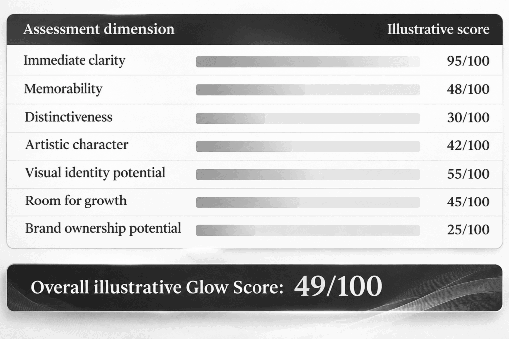
Overall illustrative Glow Score: 49/100
The important finding was not that the original name was bad.
It was that the name was performing the wrong job.
For a product category, descriptive language can be useful.
For an independent art brand seeking recognition, distinction matters more.
The challenge was to retain enough relevance for customers to understand the offer while creating an identity that could stand apart from the category.
These scores reconstruct the naming decision for demonstration. They are editorial assessments, not historical test measurements or verified market data.
03 — Finding the Hidden Constraint
When clarity becomes confinement
The original name contained an assumption:
The business should be named after what it sells.
That assumption initially appeared sensible.
But it narrowed the available possibilities.
If the brand was defined by prints, what happened when it introduced original works, acrylic editions, sculptural pieces or exhibitions?
If the brand was defined by abstraction, what distinguished its particular form of abstraction from everyone else’s?
The naming problem was not simply a shortage of interesting words.
It was the frame governing the search.
The work needed a name that expressed an artistic identity rather than a product description.
This changed the brief.
We were no longer looking for a better way to say “abstract prints.”
We were looking for a name that could carry the energy, character and future of the work itself.
04 — The Naming Direction
From product description to artistic identity
The work suggested several recurring ideas.
Energy. Forms appeared charged, compressed or held in tension.
Structure. Relationships between shapes, edges and intervals mattered as much as the individual elements.
Material presence. The work needed to feel substantial rather than purely digital.
Experimentation. Each series investigated a different visual condition.
Continuity. The name needed to accommodate future work without requiring another identity change.
These became the creative criteria.
The strongest direction combined a short, memorable source of energy with a word suggesting artistic production.
That direction produced:
VOLTWORKS
05 — The Candidate
VOLTWORKS
Two familiar words. One new identity.
VOLT introduces electrical potential, charge, force and energy.
WORKS suggests artistic production, a body of work, a studio and the act of making.
Together, VOLTWORKS carries more than a description of what is sold.
It suggests a place where energy becomes visible through form.
The name also creates room for a broader artistic practice.
VOLTWORKS can accommodate limited editions, original artworks, exhibitions, new materials and distinct collections.
It does not depend on a single product format.
What the name communicates
-
Contemporary creative character.
-
Energy and physical presence.
-
A recognisable studio identity.
-
Flexibility across artistic media.
-
A direct, memorable wordmark.
The shift: from naming the product to naming the source of the work.
06 — The Comparative Glow Report
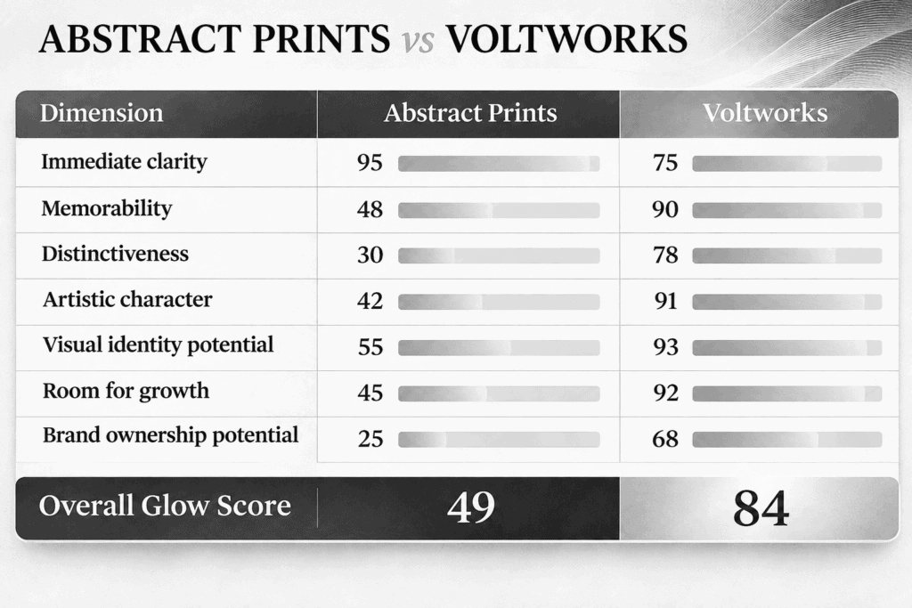
The result
ABSTRACT PRINTS — 49/100
VOLTWORKS — 84/100
Glow improvement: +35 points
The new name sacrifices some immediate product clarity.
That is a deliberate trade-off.
VOLTWORKS does not tell every first-time visitor that the business sells abstract art. The website, imagery and supporting copy must establish that context.
In return, the name gains memorability, artistic character and room to grow.
The improvement is not simply that VOLTWORKS sounds more interesting.
It changes what the business is able to represent.
07 — The Pressure Test
Where VOLTWORKS succeeds
Recognition
Short, direct and easy to pronounce. The name has a strong visual shape and works naturally in uppercase.
Relevance
The electrical association connects with the energy, tension and force present in the artwork without describing individual pieces.
Flexibility
The name can accommodate changing collections, materials and formats.
Visual potential
The wordmark can support restrained typography, gallery-style presentation, edition numbering and a consistent visual identity.
Positioning
The business moves away from generic wall-art retail language towards a recognisable independent art practice.
Where VOLTWORKS remains vulnerable
A Glow Report must also examine what a name does not solve.
Generic construction
The combination of an evocative word and “Works” is familiar across creative studios, workshops and commercial businesses.
Industry ambiguity
Without visual context, VOLTWORKS could suggest electrical engineering, industrial design or manufacturing.
Search competition
Both component words are common. Exact-name competition and trademark position require investigation.
Artistic individuality
The name communicates energy and production, but it does not fully express the more unusual conceptual character of the work.
These are not reasons to reject the name automatically.
They are constraints to understand before investing in the identity.
A strong name is not one without weaknesses. It is one whose strengths justify the trade-offs.
08 — The Brand Expression
Making the name visible
A name gains meaning through repeated contact with the work it represents.
For VOLTWORKS, the visual identity should avoid the obvious electrical clichés.
No lightning bolts.
No neon effects.
No industrial machinery.
The artwork itself should provide the energy.
Recommended direction
Typography
Confident, minimal sans-serif lettering. Strong spacing and clear hierarchy.
Colour
A restrained website palette that allows the artwork to carry the colour.
Imagery
Large, uninterrupted views of the artwork. Surface, texture, edge and spatial relationships should remain visible.
Presentation
Gallery-style layouts, consistent edition information, clear collection names and generous space around each work.
Voice
Direct, visually grounded and free from decorative art-world language.
Positioning statement
VOLTWORKS creates contemporary abstract art exploring the tension between colour, form and force.
Brand line
Where force takes form.
The purpose of the visual identity is not to illustrate the name literally.
It is to make the name inseparable from the character of the work.
09 — What the Name Change Makes Possible
Before
Abstract Prints operated primarily as a descriptive retail identity.
The name directed attention towards a category of products.
After
VOLTWORKS creates the basis for a recognisable artistic identity.
Individual collections can develop their own character while remaining connected to a single source.
Limited editions can carry consistent branding.
The website can present the work as a developing artistic practice rather than a general catalogue.
Future materials and formats can sit under the same name.
The brand becomes more than a label attached to individual products.
It becomes a structure capable of holding an expanding body of work.
These are strategic opportunities created by the naming change, not measured claims of increased sales or recognition.
10 — The Final Recommendation
GLOW REPORT VERDICT
VOLTWORKS
Recommended over ABSTRACT PRINTS
Illustrative Glow Score: 84/100
Why it wins
VOLTWORKS provides a stronger foundation for recognition, artistic positioning and future growth.
It gives the business a distinct voice without restricting it to a particular medium.
It moves the identity from the product being sold to the artistic practice producing it.
What remains unresolved
The name retains a degree of generic studio character. Its commercial distinctiveness must be checked against existing uses, relevant trademarks and search competition.
A further naming exploration could produce a more individual identity.
The recommendation is therefore strong, but not unconditional.
That distinction matters.
A Glow Report is not designed to manufacture certainty. It is designed to make a decision more informed.
11 — What We Would Test Next
A name can perform well in a creative review and still encounter problems in the market.
Before a full launch, the next stage would examine:
-
Search identity — What already appears for the exact name and close variants?
-
Trademark position — Are there relevant registered marks or applications in the intended markets and classes?
-
Domain and social availability — Can the business establish a consistent digital identity?
-
Audience response — Can prospective customers remember, pronounce and correctly associate the name?
-
Visual application — Does the name work across a website, artwork certificate, packaging, exhibition signage and social media?
These checks separate creative appeal from commercial readiness.
A name should survive both.
12 — The Glow Report at a Glance
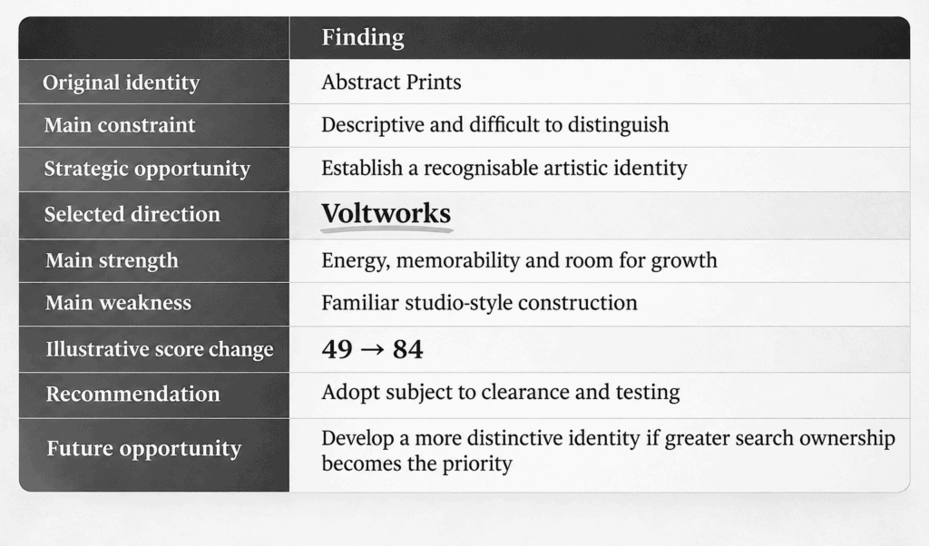
What This Example Reveals
The most valuable part of a naming exercise is not always the new name.
It is the change in understanding that makes a better name possible.
Abstract Prints was not failing because its words were unclear.
It was restricted by the assumption that the business should be defined by the products it sold.
Once that assumption was questioned, a wider naming territory became available.
VOLTWORKS emerged from that wider territory.
And even VOLTWORKS remains open to further examination.
That is how Sift & Nail approaches naming.
We don’t simply search for better words. We investigate the assumptions restricting the search, expose the trade-offs, and identify the strongest direction the evidence supports.
13 — Your Name Under the Microscope
What is your name really communicating?
Your current name may be clear but forgettable.
Memorable but misleading.
Distinctive but difficult to pronounce.
Or perfectly suited to the business you started, while restricting the one you are becoming.
A Sift & Nail Glow Report examines the whole picture.
What works. What holds you back. What deserves to stay. What could become possible.
The result is a clear assessment, a reasoned recommendation and a direction you can act on.
SIFT & NAIL
Find the constraint. Make the change count.
Request a Glow Report